Primado - name and image
When I decided to produce a wine, the question of a name naturally arose.
At the time, a large number of wines had "Quinta" in their names, even though they might not have been made exclusively from grapes grown on those estates.
Even though our wine would only be produced with our own grapes, I decided that I didn't want ours to be just another "Quinta".
Rather, I wanted the name to reflect the essence of the wine. I also wanted it to be easy to pronounce in our language and by speakers of other languages.
So I came up with the word Primado, meaning primacy, superiority, supremacy, expressions that so well characterised our intentions for the project.
Meanwhile, it was necessary to create an image capable of conveying the spirit of the wine. Benefiting from the good fortune of having one of Portugal's most awarded designers as a friend, João Borges, I asked him to dedicate some of his expertise to the graphic design of the various elements. The work he presented me could not have been more in line with my wishes. No detail was overlooked and I'm especially pleased that both the image and the name of Primado have been repeatedly praised.

Testimonial from João Borges about Primado's work.
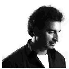
PRIMADO label image designer
2007 was one of the turning points in my professional career, when I began to favour larger proposals and put off smaller ones. I declined a few graphic design invitations, one or two "applications", so that I could dedicate myself to developing museography and environment work. It was my transition from purely graphic design to museography and exhibition scenography, where I felt I was "living" communication design! In this period of ambition for more complex projects, my friend Manuel Pereira de Melo was starting what is today the production of a wine of Excellence. I had already had the fleeting experience of designing some labels at the invitation of some of today's recognised winemakers, but Primado was an invitation I couldn't refuse, even for personal reasons! And it's still my label today. In the conversations we had at the time, the notion of branchiness, sobriety, personality, roots, elegance, flavour and timelessness stood out. All terms that I also associate with Manuel Pereira de Melo's personality. I don't remember doing many mock-ups, I don't think. The label happened almost as it still does: a "dance" of branches, with a hand-drawn, cursive texture, filled with a single colour, drawing the space where the name appears (written in a serif font), with a classy timbre. Between versions over the years, the label on the bottle has remained identical in its main details. I even think it should stay that way because what matters is the development of the wine it contains! I'm not sure that the design of the label matches the wine... here's to the Primado!!!
João Borges
Atelier João Borges
I suggest you consult João Borges' extensive work and brilliant CV at atelierjoaoborges.pt.
Manuel Pereira de Melo